6 min read
2026's Best 10+ React Component Libraries for Developers
Delivery Manager & Software Architect
Ready-made React component libraries can play a massive role in rapidly building user interfaces. From our experience with many of our clients, the speed of development and faster releases to production are frequently more essential than the uniqueness of the front-end components used in the product.
That is why our React team tried and tested various front-end component libraries. And here are the ones we liked the most.
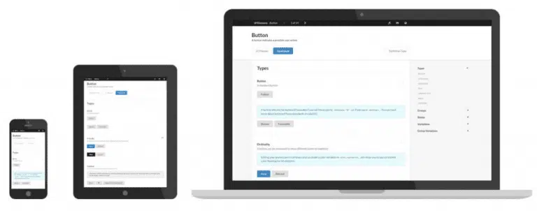
Ant Design
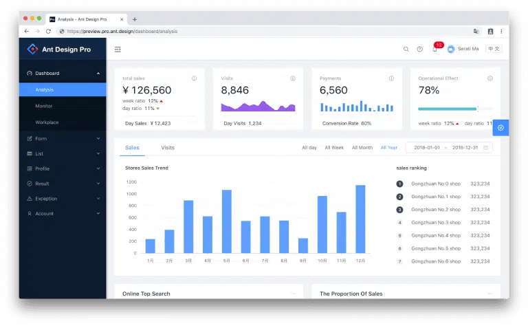
Ant Design is a Chinese company with a React library designed for web apps of large companies. Baidu, Alibaba, and Tencent are a few examples. The TypeScript-based library, which has over sixty parts, uses predictable, static types. In addition, its documentation is clear, well-written, and comprehensive in English.
A React UI library, though, is not all that Ant Design is. Instead, it is an entire design framework based on development principles, significance, certainty, and naturalness. View their resources for Sketch plugins, landing page templates, Figma UI kits, and more.
MUI Core
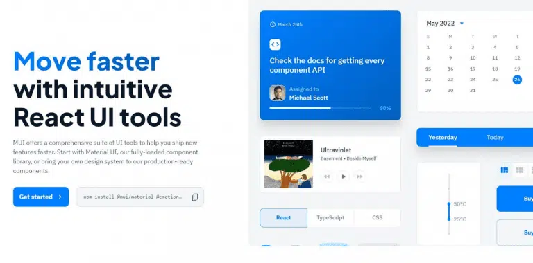
The second most popular React component library on GitHub is MUI Core, formerly Material-UI. The React library is straightforward, small, and constructed by Google's Material Design guidelines. Layouts, forms, navigation, data display, and numerous other widgets all have their own components.
A fast, extensible CSS-in-JS solution that offers the same benefits as styled-components can be used to style your components. You don't have to use MUI Core's own styling because it is also compatible with many other prominent styling options.
Blueprint
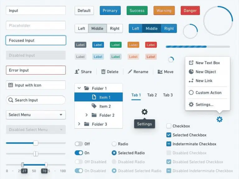
The US-based tech company Palantir, specializing in big data analytics, created the Blueprint React UI library. Over forty components from their React library are specifically designed for complex data-dense desktop application user interfaces.
All of the code samples in Blueprint's documentation are also written in TypeScript. The library supports Chrome, Firefox, Safari, IE 11, and Microsoft Edge. Due to their lack of support for CSS Flexbox Layout, anything IE10 and lower is not supported.
React Bootstrap

React Bootstrap replaces Bootstrap JavaScript. You don't need jQuery dependencies because each component has been developed as a genuine React component. One of the first React libraries, React Bootstrap, has grown steadily alongside React.
Thanks to Bootstrap's grid system, you will have a fully responsive set of containers, rows, and columns for your layout. Numerous options are available, including jumbotrons, carousels, toasts, and badges.
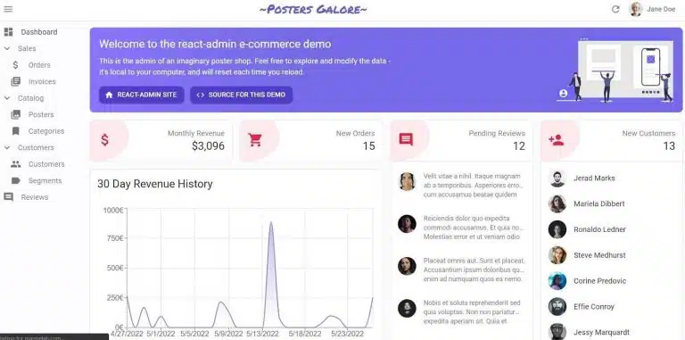
React Admin
React Admin framework is used to create API-based B2B applications using current React and Material Design. It emphasizes productivity and maintainability so you can quickly build internal tools, ERPs, or B2B apps.
React Admin has adapters for most REST and GraphQL dialects, including Django, Prisma, and Firebase. As an alternative, you can quickly create your own adapter. React Admin is essentially independent of backends. Because of this, more than ten thousand businesses use it, including Puma, Intel, and Nvidia.
Evergreen
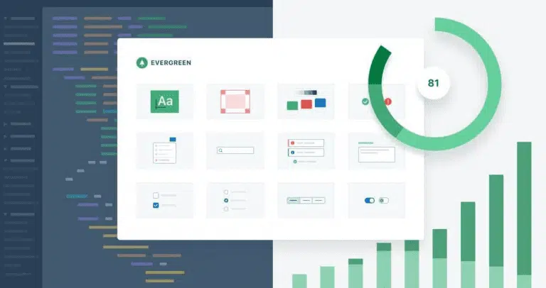
Evergreen is a React library developed by data platform company Segment. Evergreen contends that even though it is impossible to predict the future, you can always plan ahead. It's a library made to help developers create systems that can adapt to new and changing design requirements.
A few of the elements of Evergreen are buttons, filepickers, select menus, spinners, side sheets, and tables. Evergreen v5 only partially supports theming, but the developers plan to introduce a new theming API in v6 that should make theming more robust and available.
Chakra UI

With simplicity, modularity, and accessibility in mind, Chakra UI was created in 2019. It is opinionated, compatible with dark mode, and has a fairly simple prop-based styling component model.
Chakra UI gives programmers the flexibility to change the CSS classes of exported components and layouts quickly. Because responsive styling is already supported, custom styling is much simpler.
Gestalt
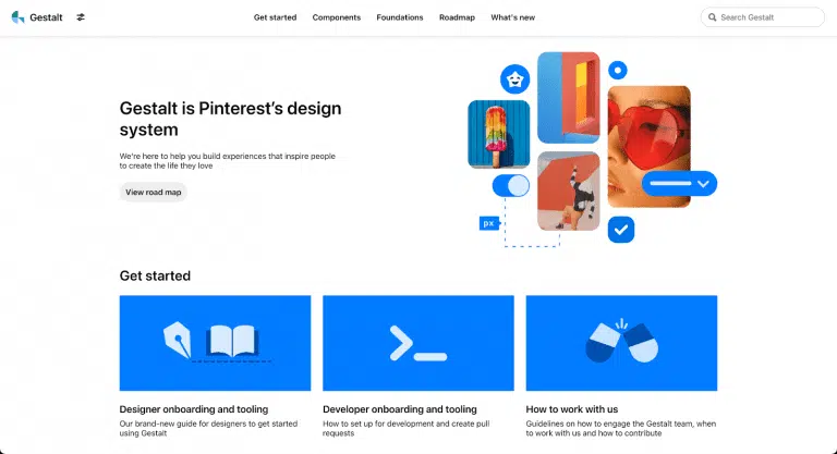
React UI components called Gestalt uphold Pinterest's design aesthetic. A shared library of design best practices is what it aims to produce. In addition to internationalization and dark mode, the library supports right-to-left.
Gestalt requires little maintenance because of its cross-platform, automatic design, and code updates. It provides a codemod to simplify the upgrade process when a release results in breaking changes, whether in usage or typing.
React Virtualized
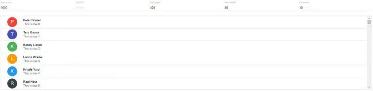
React Virtualized stands out on this list because it has a single, focused use: quickly rendering large lists and tabular data. This library can be useful if you need to render numerous columns in a single table or have a list with thousands of elements.
An arrowkeystepper, an autosizer, a cellmeasurer, a columnsizer, a multigrid, and other components are included in React Virtualized. It is a flexible library that is designed to meet your tabular needs.
Visx
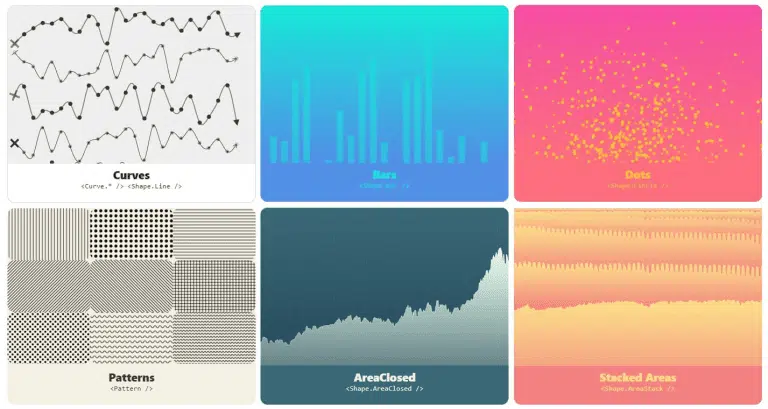
Visx is a beautiful, unbiased collection of expressive, low-level visualization primitives for React developed by Airbnb. The fact that it is a collection of packages allows you to use any package you require while maintaining a small bundle size.
Networks, heatmaps, geographical projections, statistics, word clouds, and other layouts are available. These visualizations are all calculated using D3. This library is for you if you enjoy dynamic, customizable charts.
Semantic UI React
Semantic UI The official plugin for Semantic UI is React. It lacks jQuery and has a declarative API in addition to shorthand props, sub-components, augmentation, auto-controlled state, and other features. Over fifty different components, including segments, progress bars, transitions, pagination, and more, are available in the library.
Semantic UI React provides the components, and the themes are offered by Semantic UI as CSS stylesheets. Instead of using Icon name='my-icon' />, you can use custom icons by using Icon className='my-icon'/>.
Rebass
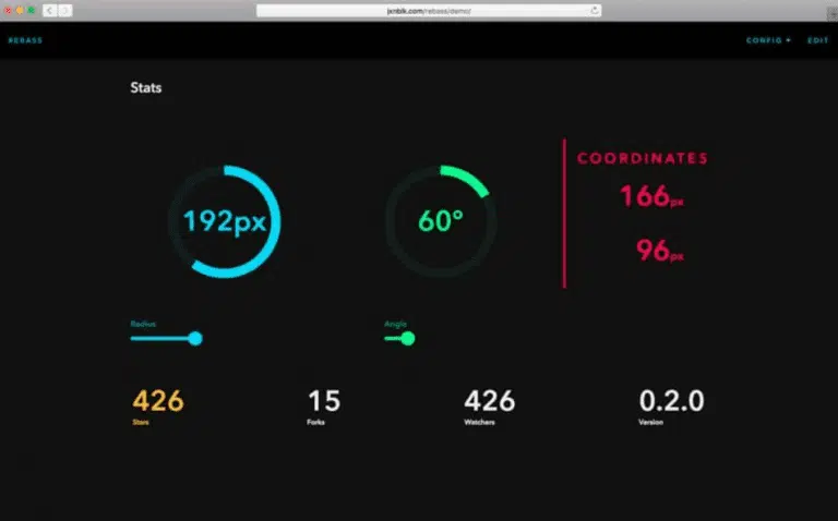
Brent Jackson created the Rebass primitive component library using the Styled System. It's designed with design limitations and user-defined scales to produce a consistent user interface. Rebass means quick design and development with a footprint of only 4KB.
Rebass' first-class support for theming and compatibility with Theme UI is part of its effort to be minimal, practical, unbiased, extensible, and themeable. The documents contain a list of guides on various subjects. To find out more about the Rebass philosophy, read this blog post.
Headless UI
A group of fully functional, completely unstyled UI elements is known as headless UI. If you want to make the design yourself, Headless UI is a great option because it separates the logic from its visual components (or has been given a particular design). With Headless UI, you can apply your unique styles to pre-built components.
There are currently only a few components in Headless UI, but the Tailwind CSS developers are actively working to increase that number. Headless UI has been designed to integrate with Tailwind CSS.
Conclusion
Choosing the right React component library for your project greatly impacts your application's overall design and functionality, so it's imperative to fully base your choice on the specific requirements of your project and what features you are looking to implement. Whether it be for the purpose of UI design, animation, or data visualization, there is a component library that is best suited for your specific needs, and we hope to have provided some valuable insights about some of the best component library choices to help you narrow it down.
Written by: Mamuka Mamulashvili
About the author

Delivery Manager at Redberry
Co-founded Redberry's Laravel Bootcamp
Built E-space, EV Marketplace
Giorgi is a Software Architect and Laravel engineer at Redberry who has delivered production platforms across EV mobility, banking, car rental, and professional-services SaaS. He built E-space, an EV-charger marketplace, the ProCredit Bank website, and Skippit, a multi-tenant ERP for professional-service firms. He also co-founded Redberry's Laravel bootcamp and authors the company's PHP and Laravel developer tutorials.
Last updated on Jul 10, 2026 by


Meet the authors
We are a 200+ people agency and provide product design, software development, and creative growth marketing services to companies ranging from fresh startups to established enterprises. Our work has earned us 100+ international awards, partnerships with Laravel, Vue, Meta, and Google, and the title of Georgia’s agency of the year in 2019 and 2021.


.webp&w=1920&q=75&dpl=dpl_9xQxFYDVmEx871eGvoCPifh1CjuD)